Please Note: All images seen below are of my students artwork only. These photos/lessons are not posted in any particular order regarding the flow of my curriculum.
“Mixed Media Bouquet of Flowers”


Finished artwork is 9×12″ with an 11 x 14″ white paper border.
This 5 day ( 40 min. each class) mixed media art lesson focuses on 6 of the 7 Elements of Art; Form, Line, Shape, Color, Texture, and Value. This art lesson is inspired from a combination of two art teachers- Laura athttps://www.paintedpaperart.com and @amymcreynolds on Instagram with some variation.
To view my blog post on this lesson and view the step by step instructions with photos, learning goals, and additional artwork please click on my link below!
“Mixed Media Bouquet of Flowers” by 4th grade
I also have vase tracers (5) on my TpT page for this lesson for $2
My TpT store is HERE!
Victorian Architecture
UPDATE: NEW YOUTUBE TUTORIAL ON THIS LESSON BELOW!

4th graders did such a beautiful job creating these Victorian houses!!
Students learned about Victorian Architecture and learned about some of the common characteristics found within the Victorian architectural style, (i.e., gables, turrets, towers, bay windows, fish-scale shingles, dentil details, brick details, decorative “gingerbread” details etc.) and were challenged to envision and create a drawing of their own Victorian style house that included some of these elements. Students had handouts to refer to of various victorian style homes, and step-by-step drawing sheets to use as reference while they worked.
Students used a ruler to draw any straight lines within their work. I also demonstrated how to draw stairs that looked three-dimensional, bay windows, fish-scale shingles, stone details, and brick.
Once finished, students carefully colored in their unique Victorian homes using a monochromatic color scheme (a color scheme of lights and darks using only one color) with colored pencils.
I demonstrated to students 3 ways to create a monochromatic look. One way was to create tints and shades of their chosen color by crosshatching white (pressing hard) over another color until the desired tint was achieved. Here students also learned how to create a shade, by crosshatching black over their chosen color (pressing lightly) until the desired shade was achieved.
The second way to create a monochromatic look is by creating various shades of their color simply by the amount of pressure used when coloring. Pressing super light will create the lightest shade, and as you press harder, the color will appear darker.
The third way is by selecting various shades of their chosen color from the colored pencil bin (e.g., mint green, lime green, dark green etc.)
Details like brick chimneys, stone walls, roofs, and curtains in windows could be colored in with other colors (e.g., brickwork for chimneys could be colored in with reds, browns, pinks; stone walls could be colored in with greys, tans, browns etc., curtains could be any color).
Students did such an incredible job creating these drawings! They worked very hard and I’m very impressed!
Learning Goals:
– Expands knowledge of color and demonstrates an understanding of a monochromatic color scheme
– Gains an understanding of value, and learns how to create tints and shades of a color
– Be able to identify characteristics of Victorian architecture and create them in their artwork
-Understands and applies the Elements of Art (Line, Shape, Color, Space, Value, and Texture) in their artwork
-Connection to math and history
*******Please Note: Some years I taught this lesson using only a monochromatic color scheme to color with, some years using only an analogous color scheme, and some years with any colors students wanted to use as you’ll see in the students artwork below! *******
UPDATE: I just added an extensive resource package on Victorian Architecture which includes 12 PDF printable sheets in my TpT account (10/13/25) (link to my TpT is HERE
This would be a great fit for drawing haunted houses if it’s around that time of year too! Just have kids make the windows cracked, broken, add ghosts, black cats, pumpkins in the windows! You could add a graveyard in the yard, bats flying, and jackolanterns on the front steps etc.!


I love how each one is so unique!!


TO VIEW MORE DETAILS ON THIS LESSON, SEE STUDENTS CREATING THEIR HOUSES, AND VIEW SOME OF MY POWERPOINT, GO TO MY “SEARCH” (in drop down menu) THEN TYPE IN “VICTORIAN HOUSES- 4TH GRADE” TO GO TO MY BLOG POST ON THIS LESSON.
ART EDUCATORS:
JUST ADDED (10/13/25) to my TpT a printable PDF document which includes 12 sheets on Victorian Architecture. Visit my teachers pay teachers store HERE
All are unique, and hand drawn.
Included in this extensive resource are:
(8) pages of step-by-step drawing instructions on how to draw Victorian architectural elements to draw a Victorian style house (6 steps max per page).
The above mentioned 8 pages include the following:
-Steps on how to draw a bay window
-Steps on how to draw fish scale shingles
-Steps on how to draw gables with gingerbread details
-Steps on how to draw a turret and a tower
-Steps on how to draw 3D steps for the house
-Steps on how to draw railings for the steps
-Steps on how to draw bricks for a chimney, part of the house or foundation
-Steps on how to draw a stone foundation or walkway to the front door
Also included are:
3 unique, hand drawn Victorian houses (uncolored) for visual reference and inspiration while drawing.
As well as a practice worksheet that is labeled and sectioned, to have students practice drawing these elements on during art class before they move onto drawing their own house.
Use to print out, make copies and staple into packets for students to use as reference when drawing their own unique Victorian house.
Easy to follow steps that my 4th graders use when creating their Victorian homes. Can be used for other grades as well.
Connects to math (geometry)
Recommended for 4th grade and up.
You can use my new YouTube tutorial “Drawing a Victorian House” alongside these resources in your classroom.
You can break up the video into chunks per art class.
The first 20 minutes of my video would be great for day 1 of the lesson.
Overall, my 4th graders need 5-6 40 minute classes to complete the drawing (including sharpie and coloring in)
The video shows me explaining:
What is architecture
Victorian architecture
Shows photos of various Victorian houses with me describing each Victorian element (with arrows and text that correlate on each photo
Demonstrating how to draw each (bay window, 3D steps, fish scale shingles, brick patterns, stone details, turrets/towers, and gables with gingerbread details) on a practice sheet (which is the same practice sheet included on my TpT resource!)
Shows how to draw a complete Victorian house step by step, including coloring.
Also in my video I talk about:
- acute and obtuse angles
- using rulers
- tips on holding the pencil to create lighter lines
- how to color in bricks to make them realistic
- the element of art value and how to create different values with colored pencils
- and the video includes students examples and the goals for the lesson
Click HERE to go directly to my TpT page (Teachers Pay Teachers) to access them!
Printmaking~ Victorian House Prints
After students finished coloring in their Victorian houses they used their previous knowledge on printing (from their 3rd grade complementary creature prints) and created a print of their Victorian house.
To do this, students taped a photocopied image of their drawing (I had their drawings photocopied once their drawing was complete in pencil) onto a sheet of styrofoam.
Students traced over all the lines within their photocopied image with a dull pencil, pressing into the paper and styrofoam in order to transfer the drawing of their house. To ensure a clear print, students then took off the photocopied sheet and went over their lines in the styrofoam once more with pencil. This way, the grooves from copying their lines would be deeper, to create a cleaner print.
On day 2, students then colored their houses in on the styrofoam using markers. Students could color in their house any way they wanted except all windows were colored in yellow or black to make it look like the lights were either on or off.
After coloring their styrofoam sheets, students wet a piece of 9 x12″ 80# drawing paper using a spray bottle, (spraying 7 times -2 at the top corners, 2 in the middle, and then 2 on the bottom corners, then one more in the middle) then spread the water evenly using a damp sponge. Here I already have pre-dampened sponges ready for kids to use. They then pressed the styrofoam sheet, face down (color side down), over the wet paper. The goal with this step is to make sure they kids don’t move the styrofoam once it comes in contact with the wet paper, or else it creates a blurry print. They need to keep one hand holding it down at all times while the other hand presses in other areas. A brayer is also used and rolled over the styrofoam to help really press into all areas. I demo all these steps beforehand.
The water from the wet paper lifts the marker off from the styrofoam. After pressing over the entire surface carefully without moving it, the styrofoam sheet is lifted off and their image transfers to the wet paper.
Students repeated the coloring and printing process, creating 3 prints to obtain the clearest print possible.
Learning Goals:
– Furthers understanding and skills on printmaking


WAYNE THIEBAUD INSPIRED MIXED-MEDIA DONUTS!

4th Graders did such an awesome job creating these super fun donuts inspired by Wayne Thiebaud!
This was a fun 3 day lesson. On the first day, students were introduced to Wayne Thiebaud and viewed a slideshow of his artwork. We discussed how his paintings of cakes, donuts and other sweet treats looked so real, and how the texture of his thick layers of paint for frosting looked like real frosting!
To create their mixed-media donuts, students folded a piece of medium weight 9×12″ tagboard in half to create a crease, opened it up, then colored over the entire sheet with various colored oil pastels. The top section was colored in with one design and the bottom section using other colors for a 2nd design.
On the second day, students painted over their oil pastel covered paper using 2 colors of their choice with liquid tempera, one color on the top and one color on the bottom section.
Once one section was painted, they used texture combs to run over the painted area while still wet to create various lines within the paint. I made the texture combs from recycled plastic gift cards by cutting notches along one side.
They then painted the bottom half and ran the texture comb along that section too.
On the final day of the lesson, we talked about perspective and I demonstrated how to draw a donut (not viewed from above) but from eye-level, resting on a table in front of you. To do this, students drew an oval with a smaller oval near the top of the donut. Frosting was drawn dripping around the top of it and into the hole of the donut as well. They colored in their donuts using markers or colored pencils and then the donut was cut out, glued on top of half a doilie, then used puffy paint (students LOVED this step!) on their donut to create sprinkles (creating more texture!)
A BIG thanks to Cassie Stephens (https://cassiestephens.blogspot.com/) for sharing this awesome idea!!
Kids had a blast creating them, and I LOVE how they turned out!!
Learning Goals:
-Learn about the life and artwork of Wayne Thiebaud and can identify his work
-Demonstrate an understanding on how to create perspective in artwork
-Can define texture, and demonstrate an understanding on how to create texture in artwork


Click HERE TO VIEW MY ART VIDEO TUTORIAL ON THE MIXED-MEDIA DONUT LESSON!
Enlarged Flower Drawings Inspired by Georgia O’Keeffe

Students learned about the artist Georgia O’Keeffe, and viewed examples of her flower paintings. We talked about the scale (size) of her work and that her flower paintings were so large because she thought flowers were incredibly beautiful and wanted people to notice them! She loved to create close-up paintings of flowers. Looking at her flower paintings is like looking at a flower with a magnifying glass!
We also reviewed what abstract artwork is (artwork that focuses on mainly lines, shapes and colors), which is how Georgia O’Keeffe depicted a lot of her flowers in her work. She focused on just small sections of a flower –instead of the entire flower in a lot of her work, therefore abstracting the image. Not all of her flower paintings are abstract, but many are.
DAY 1:
I showed students multiple examples of her flower paintings through a power point presentation and discussed her work and background.
After demonstrating how to focus in on one area of a flower and block out the rest (students could choose their own printed flower image to observe) by using a viewfinder, (using a black square piece of construction paper with a small (about 2×2″ square) cut out in the middle). Students had to select an area of their flower so it’s petals touched or ran off at least 3 sides of their viewfinder (see pics below).
Students then practiced drawing and enlarging small sections of their chosen flowers, in their sketchbooks. They did this 3 times, each flower drawing on a different page in their sketchbook. They had a choice of choosing 3 different flower images OR drawing from 1 flower image but focusing in on different areas of the flower each time.
DAYS 2-3:
Students selected 1 photo of a flower for their final drawing. They enlarged a section of their flower on 12×12” paper, making sure that their drawing of their chosen flower ran off or touched at least 3 of the 4 sides of their paper, while considering the composition (how and where things are placed on the page).
Once drawn, students colored in using oil pastels. Students had a choice of coloring in their flower any colors they wanted!! In previous years I had students color in their flowers trying to best match their flowers colors in the photo. The only rule with color I had was, was to switch to a different color when their was a transition of color in their flower photo. Also, If their was a bit of background showing in their composition, (some students selected areas of their flower that only showed the flower– without any background) they needed to color it in with any one chosen color for contrast.
DAY 4:
For a final step, students created a bit of depth within their flower by adding shadows around the edges of their flowers petals with black oil pastel, then blending with their finger. Adding black for shading with oil pastels is a pretty tricky step, and can be a bit challenging, but I think students did a wonderful job adding that element to their artwork!!
I absolutely LOVE these flowers!!
Learning Goals:
- Students learn about the life and artwork of painter Georgia O’Keeffe and can identify her work
- Students can define and identify abstract artwork
- Students can use their observational drawing skills to draw an enlarged flower
- Students can blend colors together using their finger
- Students can create depth within artwork by drawing overlapping petals and adding shading
- Students can use a viewfinder to narrow their field of vision


Aren’t these gorgeous???!!!! I LOVE them!


To view my post on this lesson (I just added a new one on 5/10/26) and view step-by-step directions with accompanying photos and additional artwork click HERE
COLLABORATIVE ENLARGED FLOWER DRAWING- Inspired by Georgia O’Keeffe
(photo of students artwork below all pieced together of Georgia O’Keeffe’s “Red Poppy VI”)
I am SO impressed with the attention to detail students gave to each of their drawings!! Isn’t it AMAZING??!

(Below image is of the print out copy with grid pre-drawn before cutting into squares for students )

(Below is a photo of her painting “Red Poppy VI” in its entirety)

(photo of students artwork below all pieced together of Georgia O’Keeffe’s “Pink Tulip, 1926”)

(Below is Georgia O’Keefe’s painting that I cropped before drawing the grid)

(Below is her painting “Pink Tulip, 1926” in its entirety)

This was a super fun one day lesson (one 40 minute art class) on a continuation on learning about Georgia O’Keeffe.
Each student in one 4th grade class got a tiny 1 and 1/4” section of a photocopied image of Georgia O’Keeffe’s “Red Poppy VI” and in another 4th grade class a 1 and 1/4″ section of Georgia O’Keefe’s photocopied image of her painting “Pink Tulip, 1926” to copy on a 6” square of 80# drawing paper.
Each tiny photo had a number written on the back as well as the word “Top” along the top edge, so students knew how to view their image before drawing on their 6×6″ paper.
Students wrote their corresponding number on the back of their 6″ paper as well as the word “top” along the top edge. This would make assembling the flower a whole lot easier for me later on!
They then drew the lines and shapes first with pencil then colored in trying to best match the colors of the print out.
Once complete, I brought them all home and assembled together on large white paper with hot glue.
These both measure out to be 30” x 36” total.
I think students did a FANTASTIC job creating these beautiful flowers together as a class!! What do you think?
To view my blog post on this lesson with additional photos with kids working on it please clickHERE
Learning Goals:
-Can define what collaborative art is
-Can define abstract art and create an abstract drawing
-Can blend oil pastels together to create various colors
-Learn about Georgia O’Keeffe and her artwork and can identify her flower paintings
DANDELION PUFFS
Additional artwork below!!

This easy and fun 2 day art lesson focused on the elements of art; Line, Shape, Color and Value. Students also learned about a new watercolor resist technique using rubber cement before painting!
Special shout out to artroombritt.blogspot.com for this lesson idea!
DAY 1
Students observed various drawings of dandelions and reviewed the meaning of composition in artwork, (composition= the way things are laid out or where things are drawn/placed on paper).
Students drew three stems spaced apart a bit coming from one side of a sheet of 9×12″ tagboard with pencil. They could be drawn coming from either side of the paper going towards the middle.
They drew a small circle at the tip of each stem for the dandelions center and then lightly drew a large circle around it to act as a guideline to where their dandelion seed heads would be drawn to, to create a full, fluffy dandelion puff.
Students drew 1 large dandelion and 2 smaller ones on either side of the large one. Then drew a variety of seed heads stemming out from the center of each dandelion. I demonstrated various seed head tips for drawing before students drew on their own papers. I also offered a handout to refer to and observe, if they wanted while drawing.
Then once all three were drawn, they added drifting seed heads blowing away from the dandelion puffs in the wind. These drifting seed heads were drawn traveling in different directions (just like in real life) and not only adds interest, but creates a nice composition with the three dandelions along the opposite side.
Then students went over their stems lines and dandelion puffs lines and drifting seed heads with a black sharpie. After using sharpie they erased any pencil lines that remained.
 Once that was done- after class, (when students were no longer in my art room), I brushed on a thick layer of rubber cement where each circular dandelion puff would be, as well as on the drifting seed heads. The rubber cement was a bit stinky and isn’t healthy to breathe in, so I worked next to an open window. This is why I applied the rubber cement and not the students.
The rubber cement was left to dry until the next class. (BTW- This doesn’t take up much rubber cement at all- I used about 3 small jars for 4 classes (roughly 24 students per class).
DAY 2
Before applying paint to our drawings, we reviewed warm and cool colors.
I had ice cube trays filled with liquid watercolors (one end with warm colors (warm colors=reds, pinks, oranges and yellows) and the other end with cool colors (cool colors= blues, greens and purples).
We also reviewed the wet-on-wet watercolor technique before painting. After demonstrating, students applied water only to 1/2 their paper quickly with a watercolor brush. THEN applied dabs of either just warm colored paint OR just cool colored paint onto the wet areas using one color at a time.
Students noticed how the paint spread outward from where they dabbed little bits of paint over the watered down paper. The water helps spread the paint and it also changes the value of the color making the color lighter and less vibrant (value= the lightness or darkness of a color).
Then once one 1/2 of their paper was painted, they dabbed the painted section with a paper towel while still wet, to help soften the color and spread the paint even more.
Then painted the other 1/2 of their paper with water only and applied paint to that wet area then dabbed off with a paper towel.
Once paintings were dry, the rubber cement was rubbed off, revealing the white dandelion puffs!


TO VIEW MY BLOG POST ON THIS LESSON WITH STEP-BY-STEP PHOTOS / DIRECTIONS AND PICS OF KIDS WORKING ON THEM – CLICK HERE
LEARNING GOALS
Students can define/identify warm and cool colors
Students can can define composition, value, and wet-on-wet painting
Students learn about various watercolor resist techniques
Abstract Tint Paintings

Students learned about the painters Wassily Kandinsky, and Paul Klee, and viewed examples of their abstract paintings.
Students reviewed how abstract artwork focuses mainly on lines, shapes, and colors with very little, if any, recognizable shapes (e.g, a bird, a moon, a house, a person etc.).
On day 1 of the lesson, students used rulers, various shaped tracers as well as freeform drawing to create their own abstract drawing on grey paper, overlapping some of their lines and shapes. Once drawn to their liking, students traced over all their lines with a thick black sharpie to create definition.
On days 2 and 3, students learned what a tint was and how to create tints with paint. Students chose 2 colors plus white for their paper plate paint palette.
Students painted in some shapes with their 2 tints, some shapes using the 2 colors without tinting, and some shapes white to create visual interest. Students had the choice of leaving some shapes without paint, revealing just the grey paper or to paint in all of their shapes.
On day 4 of the lesson, students carefully went over all their black lines once again, using a black crayon, to define and clean up the edges. They then filled out a reflection worksheet listing 2 things they like about their artwork, and 1 thing they would change or do differently. It also had information about what they learned throughout the lesson: Wassily Kandinsky, abstract art, and how to create tints. They then taped the reflection sheet to the back of their work.
The thing I love so much about this lesson is that it allows so much creative freedom. I love how each one is so unique! A big thank you to Thomas Elementary Art (http://thomaselementaryart.blogspot.com/) for such a fun lesson idea!!
Learning Goals:
– Students can describe what a tint is and create tints within their artwork
– Can describe what abstract artwork is and create their own abstract drawing
– Learn about the artists Wassily Kandinsky and Paul Klee and their artwork


RADIAL SYMMETRY PRINTMAKING

Read below to find out how we created these, see step-by-step pics and watch my YouTube tutorial on this lesson!


Printmaking is one of my favorite things to teach in art. I love it because it always has an element of surprise with the results each time. Getting all the “Ooooh’s” and “Ahhh’s” after printing is so fun and magical and is always fun to see!
4th Graders used their previous knowledge on printmaking from when they were in 3rd grade when creating their “Complementary Creature Prints”. 3rd grade students used markers to print… and this time, as 4th graders… used black tempera paint to print. We used liquid watercolors to create the background before printing a symmetrical radial design on top using black tempera paint.
I love how colorful they are and loved showing students a variation in printmaking. They did a fantastic job!
This lesson took 4 to 5 (40 minute) art classes to complete.
DAY 1 – PAINTING THE RADIAL RAINBOW DESIGN
On the first day of the lesson, we reviewed symmetry (images that are the same on both sides) and students were introduced to radial design (a design that can include any lines, shapes or colors that starts in the center, and radiates outwards in a circular way). I explained we’d be making a symmetrical radial rainbow painting.
After demonstrating, and reviewing the order of the rainbow, students then measured to locate the center of their paper, using a ruler and marked the 6″ spot with pencil. From the center out, they then painted a radial rainbow design on their 12×12″ tagboard with liquid watercolors.


DAY 2 – DRAWING THE RADIAL DESIGN
Students drew curving lines (with some space between each line) on a 6″ square piece of copy paper that had been folded into a triangle, in pencil.

Then drew different lines and/or shapes between each curving line. Making sure not to draw too small or too detailed. Simple is best. They could be a pattern of lines and shapes, but didn’t have to be.


Then students opened the paper up, and traced over their pencil lines with a black sharpie.


Then students flipped up the blank bottom half over the top half that had been traced in sharpie like below.


The drawing can be seen through the paper (as shown on the picture to the right above). Then students traced over their lines with a pencil like below.


TIP: Place a sheet of white paper underneath your work while tracing so the lines can be seen more clearly. OR place the paper on a window to allow light to shine through the backside to see more clearly as you trace. OR- rather than using copy paper folded into a triangle, use tracing paper.
Once ALL the lines have been traced, THEN unfold, by taking the bottom half out like below. You should be able to see the pencil part on top, and the backside of the sharpie part below. Here you can now see the entire design is continuous on both halves of the paper.


From here, take the paper and tape it to a 6″ square cut piece of styrofoam (the printing plate). Use clear tape and only tape it to the top in 2 areas so the paper can open and close like below. Don’t worry about the tape covering your drawing a bit.


Once the drawing is taped onto the printing plate, students started tracing over ALL the lines with a dull colored pencil. (The colored pencil lets you know where you have traced since it leaves a colored line). Press firmly as you trace. This step transfers your drawing onto the printing plate.

It’s a good idea to check to see if its transferring well enough, so flip up the taped down drawing to check how it’s coming along. As long as you can see the lines indentations on your printing plate well enough, you’re good!


Continue tracing with a dull colored pencil until the entire design is traced.

Once that’s done, students flipped over the paper they were tracing. Here you should be able to see the drawing completely transferred onto the printing plate like below.

Next, students traced over their indentations of their design on the styrofoam printing plate with a dull colored pencil. (Tracing again pressing firmly). This step is crucial and creates a nice deep indentation which creates a clear print later on. If it’s not pressed in twice (once with paper over the styrofoam, and again a second time on just the styrofoam the overall print wouldn’t be as clear when time to print.)

From here, students then colored in *some* of their shapes they created within their design with colored pencil. Again pressing firmly! Areas where it is colored in, will reveal more rainbow from the painting created. Students could fill in as much as they wanted or as little as they wanted. This step was the final step before printing, so kids were very anxious to get printing! Teacher example on left, student example on right.


Once shapes were filled in, students flipped over the styrofoam printing plate, and drew an arrow with sharpie pointing to the corner where they started their drawing.
*Technically, to print a symmetrical radial design, the arrow could be drawn pointing in ANY one chosen corner, as long as it’s in just one corner. For a complete circle design like we created, we drew the arrow in the corner where we originally started the curving lines.
HOWEVER, no matter where you place the arrow, this arrow is necessary to know where to position the printing plate on the paper each time you print. The arrow should always point to the center of the paper each time it’s printed. Doing this creates the symmetrical radial design. (More on this below). They also wrote their name and class in sharpie on the back somewhere as well.


Then the paper that was taped on gets taken off and thrown away and students were ready to print!
DAY 3 – PRACTICE PRINTING ON 12X12″ WHITE PAPER FIRST
After a printing demonstration, students created a practice print on white paper before moving onto their final copy (on their rainbow painting).
Students shared plates of black tempera paint and brayers and rolled out their brayer onto the plate of black paint a couple times. Since the paint has a slippery texture, it’s important to THEN roll the brayer onto a sheet of scrap paper to get the paint evenly distributed onto the brayer. This also gets rid of any excess paint before rolling onto the printing plate.

Then the brayer gets rolled onto the printing plate.


Once students evenly coated their printing plate with black tempera paint, they carefully lifted it up and printed onto 12×12″ white 80# paper. It’s important to have the printing plates edges lined up with the papers edges and have the arrow pointing to the center of the paper.

Then students pressed down with the flat of their hands and then used a CLEAN brayer, and rolled over the backside of their printing plate all over to transfer the design to create the first print like below.


Then, lifted it off to repeat those steps 3 more times, rotating the printing plate so the arrow pointed towards the center of their paper each time they printed.


DAY 4 – 5 FINAL STEP! PRINTING ON THE RAINBOW PAINTING!
Students reviewed the printing process and continued to print their design onto their rainbow painting that they painted on day 1!
It was fun… but very messy!!!
This is why we drew a BIG arrow! So you can see it!


Here’s my YouTube Tutorial on the lesson below.
CUT PAPER TREES


This was a fun, quick, 1 day lesson using just construction paper, scissors and glue sticks!
TO VIEW MY BLOG POST ON THIS LESSON WITH STEP-BY STEP PHOTOS TYPE IN “CUT PAPER TREES – 4TH GRADE” IN THE SEARCH BOX HERE.
I reviewed with students the complementary colors, symmetry and positive/negative space before demonstrating how to create these colorful fun trees.
Students then chose their 2 colored construction papers (1 sheet pre-cut to 9×12″ and 1 sheet cut to 6″x9″), and drew half of a tree along the edge of their 6×9″ piece with pencil.
Then students cut out their half tree.
Setting aside the cut tree, glue down remaining paper onto one side of the 9×12″ sheet.
Take the 1/2 tree you first cut, and flip it over lining up the edges of the 2 papers. Don’t glue down this piece just yet!
Now draw another half tree (or any 1/2 shape!) along the straight edge like below!
Cut out THAT half shape….
And flip that piece over…
Glue down the remaining 2 cut pieces, so everything lines up at the tree top and tree stump’s edges.
LEARNING GOALS:
Students can define complementary colors
Students can define symmetry and show this in their work
Students can define positive and negative space and create that in their work
Lesson idea from LauraLee (@2art.chambers)
Initial Design with Analogous Colors (Sketchbook Covers)

For every grade level (1st-5th) I have students create a drawing that gets mounted onto a sketchbook for each student to use throughout the year. The sketchbooks stay in my art room in grade level/ classroom bins. Each grade has a different drawing lesson and creates different artwork from other grades.
To create the actual sketchbooks, students folded a sheet of 12×18″ 60# paper in half horizontally, for the cover. Students then staple in 12 sheets of pre-cut 8.5 x11″ paper (donated extra long printer paper -8.5 x 14″- Legal size- that I cut to 8.5 x 11″ ahead of time). *Any left over cut scraps of white paper are then used for other collages/lessons. Then their drawings get glued onto the cover.
Great for when kids finish early, plus it keeps all (what usually would be) loose practice drawings all in one contained place. Students use sketchbooks to free draw in once finished with an art lesson (if they finish early), as well as to practice drawing/plan out their ideas, before doing a final version.
Growing up, I had sketchbooks and diary’s that I would draw in and I think it’s so fun to be able to look back on something like that. My students will have sketchbooks from 1st-5th grade, a new one every year to be able to look back on and see /track their own artistic growth throughout the years! Especially fun when you’re older to dig up all your old sketchbooks from your parents keepsake chest and flip through as an adult!
So, for this particular sketchbook cover drawing lesson, fourth graders created a personalized drawing using their initials.
First, students created a tracer (template) of their initials by drawing them in block letters on a small piece of manila tagboard and then carefully cut them out as one piece. I explained to students that the letters had to touch somewhere for this to work. Students could draw their letters backwards, stack them on top of each other or have them side by side. To cut out smaller areas (like the triangles in the letter “A”, or openings in the letter “O”) they used a hole puncher to open it up before cutting.
Once cut out as one piece, students were then challenged to create a dynamic design by tracing their template at least 8 times without overlapping on a piece of 8×11 80# paper. Students had the choice of drawing some initials coming off the page, as well as to create them stacked vertically, or side by side, and could trace them turned in any direction they wanted. We talked about how the letters appeared to be more of a shape rather than letters when tracing, which students really loved! A couple down below look like they have faces!
Once outlined with black sharpie, students then created an interesting background design using lines and/or shapes with pencil then colored in with an analogous color palette using marker. The letters were left white to pop against the background and be easily visible. Students overlapped colors together where needed to achieve the desired color. Pieces of scrap paper were used to test out color combinations before coloring on their final drawing.
Sketchbooks are used throughout the year to plan out ideas, work on an extension of the current lesson if finished early, experiment and have fun, and to practice drawing.
Learning Goals:
– Students develop a further understanding of the color wheel
– Can describe what analogous colors are and use them in their artwork
– Continue to develop skills on color blending / creating tertiary colors


Animal Drawings —(Foreground/ middle ground/ background)
In the beginning of this art lesson, students practiced drawing 3 animals in their sketchbooks, while looking at print out images of animals for reference.
Students learned drawing techniques on how to begin drawing the animal by breaking down the animal into simple shapes, like circles and ovals, to get the basic shape of the body.
They then selected 1 sketch to enlarge onto 12×18″ paper and drew their chosen animal in either the foreground or middle ground within the animals natural habitat.
Students learned that objects in the foreground are drawn larger and lower on the page since they are the closest, objects in the middle ground are drawn slightly smaller and in the middle of the page, and objects in the background are drawn smallest and higher on the page to show they are furthest away.
Students then colored in using colored pencils. Students learned that colors of distant objects (background) appear muted and are less detailed, compared to the colors and details of objects closer to the viewer. To create this effect in their artwork, I demonstrated how to create value changes using colored pencils by either pressing down harder or lighter to create darker or lighter values, or students could use a lighter version of their color to create the same effect.
Learning Goals:
– Students understand the definition of foreground, middle ground and background and can identify each area within artwork
– Learn drawing techniques and demonstrate an understanding on how to break down images into basic shapes
-Demonstrate an understanding of size/space relationship and show this in their work
– Demonstrate an understanding of value within artwork


Animal paintings
(Foreground/ middle ground/ background)
In the beginning of this art lesson, students practiced drawing 3 animals in their sketchbooks, while looking at print out images of animals for reference.
Students learned drawing techniques on how to begin drawing the animal by breaking down the animal into simple shapes, like circles and ovals, to get the basic shape of the body.
They then selected 1 sketch to enlarge onto 12×18″ watercolor paper and drew their chosen animal in either the foreground or middle ground within the animals natural habitat.
Students learned that objects in the foreground are drawn larger and lower on the page since they are the closest, objects in the middle ground are drawn slightly smaller and in the middle of the page, and objects in the background are drawn smallest and higher on the page to show they are furthest away.
Once the drawing was complete, students practiced painting techniques on scrap paper before using watercolors to paint their finished drawings.
Students learned that colors of distant objects appear muted and are less detailed, compared to the colors and details of objects closer to the viewer.
To create this effect, they painted objects in the foreground with more paint than water on their brush in order to achieve a darker value with a more “opaque-like” finish. They then painted objects in the background with more water than paint on their brush, in order to achieve a lighter valuewith more of a translucent finish.
Once finished paintings were completely dry, details were then added to areas in the foreground with colored pencils.
Learning Goals:
– Students understand the definition of foreground, middle ground and background and can identify each area within artwork
– Learn drawing techniques and demonstrate an understanding on how to break down images into basic shapes
– Learn painting techniques and demonstrate an understanding of value within artwork


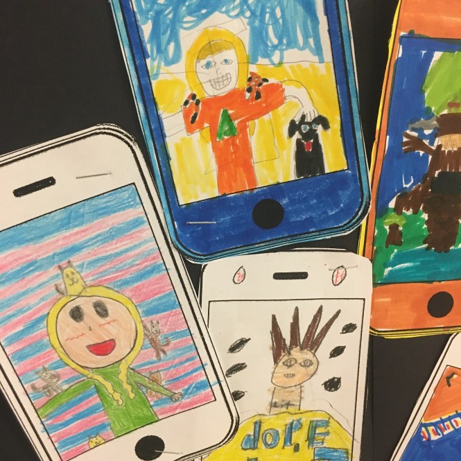
Believe in your Selfie

On the 2nd day of art class for all my 4th graders, students created a fun, quick self-portrait drawing within a cell phone. I found the image in google images and then printed and made photocopies. Students had the choice of coloring in with colored pencils, crayons and/or markers. Students loved this project! Thanks Katy Hanson for the fun idea!!


PATTERNED PUMPKINS WITH OIL PASTEL


This lesson took (4) 40 minute classes to complete.
This lesson idea is from @2art.chambers on Instagram
Students drew along with me as I demonstrated how to draw the pumpkin, under the document camera. They drew with pencil on 9 x 12“ 80 # white drawing paper.
Students drew whatever patterns they wanted, in every other section of their pumpkin.
Then used black sharpie to trace over all their pencil lines, and colored in their patterns with black sharpie.
Then they added oil pastels to the sections that did not have any patterns. They could use any colors they wanted and blended any two colors that connected.
I love the variety of line, shape, pattern and color!!! Not to mention the awesome contrast! They turned out fabulous!
LEARNING GOALS
- Students can demonstrate an understanding of overlapping and color blending and show this in their artwork
- Students can define and create patterns in their artwork
- Students can define contrast and show this in their artwork
DOTTED LEAF PAINTINGS
I have FREE Leaf templates/Tracers (PDF) of these exact leaves (3 leaves total) for this lesson in my TpT store HERE


This lesson took 7 (40 minute) classes to complete.
This lesson is inspired by the artwork of @brandon.dot.rollin on Instagram
My fourth and fifth graders did this lesson this year. A little intense being seven days to finish, but well worth it!
Students said the act of applying each dot was very meditative and calming. Students learned about aboriginal art as well as artist Brandon Rollin for the lesson.
Students had a choice of creating their leaf on black paper using one of 3 leaf templates to trace, or drawing from observation (looking at leaf drawings that I supplied).
Students each got a 12 x 12“ sheet of black construction paper. They then either chose one of three leaf templates to trace or draw their own leaves from observation on their black paper with a pencil. They then drew the leaves veins.
From there, students used the END of a tempera paintbrush to dip into their ice cube tray of paints, starting with white.
Students dotted white dots all along the outside lines of their leaf drawing, then added white dots all along the leaves veins.
Students then chose only warm colors and painted rows of dots on the inside of the leaf only. In between each color, students used a paper towel to clean the end of the paintbrush so paint colors wouldn’t mix in the tray or on their art.
Once the inside of the leaf was finished with warm colors, they used only cool colors to dot the paint all along the background in rows.
This is one of my favorite new fall projects for fourth and fifth grade (Although next year it will only be for fourth graders). I love the contrast of the bright colors against the black paper background.
I loved using the ice cube trays as a means to have all the paint colors needed for the lesson. I bought the ice cube trays online from Amazon and love how they have lids to keep the liquid tempera paint from drying out!! I have been looking for a cool and fun art lesson that utilizes paint without the need of water since I’m teaching from a cart and sinks are scarce in many of the classrooms.
I have Leaf templates/Tracers for this lesson (or for any fall art lesson!) in my TpT store HERE
Lesson idea from @kristin.alyea on Instagram
LEARNING GOALS
- Students learn about aboriginal artwork and artwork by contemporary artist Brandon Rollin
- Students can list the warm and cool colors and apply them separately in their artwork
- Students can use their observational drawing skills to create a drawing of a leaf
SPOOKY EYEBALL DRAWINGS


This was a fun 2 day (40 minutes each class ) lesson. My fourth graders did an awesome job creating these didn’t they?! Fun lesson near Halloween.
Each student got the sheet with the eyeballs printed on them. Students were asked to cut out at least three sets of eyeballs and glued them onto their 9 x 12“ 80 pound drawing paper. I told students they could mix-and-match eyes and they could certainly do more than three pairs of eyes.
I love how creative students can get with this lesson with just some eyes, pencils, markers and colored pencils!
Once glued on, students drew a creature around the eyeballs in pencil. Then students went over all their lines with a fine point sharpie. Students then colored in their picture with either markers or colored pencils or both.
LEARNING GOALS
- Students enhance their cutting skills as they cut out the pairs of eyes
- Students utilize their knowledge on various lines, shapes and colors to create a picture of a made up creature
SYMMETRICAL NAME CREATURE


This was a fun three day lesson where students folded a 9 x 12“ 80# paper in half vertically, then wrote their name (First, last, or nickname), along one side and then turned the paper around and had to write it again with their letters backwards.
The key was to keep all letters touching the centerfold line.
Once that was done, they drew additional shapes and lines to create a made up creature! Can you find the names hidden within each drawing?
I saw this idea posted a while back on Instagram but can’t find who it was who posted it. So whoever it was, thanks for this fun idea! My fourth graders really enjoyed this one!!
Once finished, they traced over all their lines with a fine point sharpie, then they colored in using either markers or colored pencils.
Then students each received a sheet asking about their creature that they filled out!
I loved reading my students answers! So fun and so creative! Definitely a keeper!
LEARNING GOALS
- Students enhance their folding skills
- Students can define symmetrical and show this in their work
- Students can utilize letters to then create an imaginary creature from the letters
BOX OF CHOCOLATES


These scrumptious boxes of chocolates were created in three classes (40 minutes each).
Perfect for Valentine’s Day!
DAY 1
Students each received a 12 x 12“ piece of 80 # drawing paper. A heart was already printed on their paper. Students drew the chocolates using a variety of shapes inside their heart, leaving space between each one. Then they drew a wavy line around each one creating a wrapper for their chocolate candy.
Students then colored in each wavy lined wrapper with black sharpie.
DAY 2
Students colored in each chocolate with crayon pressing hard as they colored. They could use any colors they wanted. Then they colored over the crayon with a brown oil pastel making sure to cover the entire candy heavily.
DAY 3
Students scratched various lines into their chocolate surface with a wooden scratch art stick to decorate each chocolate candy. This revealed the color from the crayon underneath the brown oil pastel. Then they colored the background in with markers.
Lesson idea from @artsyblevs from Instagram
LEARNING GOALS
- Students can utilize their understanding of various lines and shapes to create chocolate candies
- Students can define texture and show this in their artwork to create the candies decorations
- Students can create their own scratch art using oil pastel and crayons
TIGER PAINTINGS INSPIRED BY HENRI ROUSSEAU


This was a 3 day (40 minutes each) art lesson.
DAY 1
Students first watched a video about Henri Rousseau, and learned about the artist and his background. Then they drew the tiger following along with me as I showed them under the document camera on a sheet of 9 x 12 “ 80 # drawing paper with pencil.
DAY 2
We finished drawing the tiger, and then sharpied over all of our lines with a black fine point sharpie.
DAY 3
Students then painted with watercolors, some students added additional details with oil pastel as well in the background. I love how one student decided to completely change the tiger into a puma!
LEARNING GOALS
- Students learn about the artist Henri Rousseau and can identify his work
- Students utilize their understanding of line, shape, color and texture to create a painting of a tiger
- Students enhance watercolor painting techniques in their artwork
NEON POP OUT SELF-PORTRAITS
This was a lesson I did back in May 2018. I completely forgot to add this lesson to this page! So here they are!
I LOVE them so much! Read below the pics to see how these were created!


This lesson took (4) 40 minute art classes to finish.
This lesson focuses on The Elements Of Art: (Line, Shape, and Color) and the Principles of Design: (Balance, Emphasis, Variety, Movement, Contrast and Pattern) as well as enhancing knowledge on drawing facial details and proportion.
I don’t think this self-portrait would be the same without the POP OUT 3D element! It makes it SO much more fun!
Plus, If you’ve been following my blog or Instagram account this year, you’ve probably noticed a lot more 3D artwork in the mix. I’ve made it a goal to incorporate more 3D elements in different art lessons for each grade level, since we don’t have a kiln for firing clay pieces at either school I teach in. This was definitely a fun lesson to teach and students seemed to really enjoy it!!
DAY 1:
On the first day of the lesson students drew their self-portrait large on a sheet of 12×18″ neon construction paper. Students had a choice of pink, lime, orange, yellow, or green.
I demonstrated under the document camera to start drawing the head a little bit more than halfway up the paper, and we reviewed ways to draw facial features. I also said they could draw their eyes closed or open, or winking! They were also encouraged to draw a pattern on their shirt for added detail.
Once drawn in pencil, they went over all their lines with a black sharpie to define them and make them stand out.

I absolutely LOVE the texture and movement of this student’s hair!


Check out the pattern on this student’s shirt! Loving the detail!!!


DAY 2 – 3
The following art class students finished drawing and outlining if needed, then carefully cut out their self-portrait leaving a little neon color all the way around the edges.
They then traced their cut out self-portrait along the bottom of a piece of 12×18″ black construction paper, vertically with a pencil.


After that- they set the cut out one aside, and wrote positive attributes in pencil all around their traced self-portrait. We talked about VARIETY and BALANCE and to write some words larger than others and some diagonally, sideways, and straight across.
I had a printed list of adjectives that each student could refer to for suggestions if they needed it. Kids could write other things as well of course if it wasn’t on the list, as long as it was positive.

Then they went over their words with a white colored pencil, making sure to make some brighter and more bold than others. The bright white lettering adds CONTRAST against the black paper.

DAY 4:
On the final day, students then traced a variety of colored chalk pastels all along the traced outline on the black paper. We went over the color wheel beforehand and reviewed primary, secondary, warm, cool, complementary, and analogous.
They applied the chalk pastels in short, thick lines and then using their finger- smudged the chalk going outward and away from their outlined self-portrait to create a glowing affect.


Students washed their hands (or used baby wipes) after using the chalk pastels, then took their neon cut out self-portrait again and traced it once more but this time, onto a sheet of 12×18″ white 80# drawing paper. Then went over those pencil lines with black sharpie.

Then carefully cut that one out –leaving a bit of white paper showing all around the edges. Then glued it into place on the black paper using a glue stick.


Then later on I attached their NEON cut out to go over the white one. I originally thought it would be a good idea to hot glue strips of cut cardboard to mount between the two in order for the neon one to pop out.
HAha…. That proved to be waaaay too time consuming cutting cardboard into strips. Plus I’d have to layer more than two strips to achieve the thickness I wanted.
SOOOoooo…. scrap THAT idea!
Then I tried bending strips of cardboard (from the neon paper packaging) into an accordian fold and hot-gluing those in between the two. Like so…


That DID work….however….. it toowas VERY very time consuming (and kinda hurt my hands after awhile folding back the cardboard over and over and over).
I knew it wasn’t a very good method, but went on with it anyways. I wanted to get what I could done, since I planned on working on them that afternoon, and only had those materials on hand to make the pop out portion work. I think I got through 20 pieces of artwork.
THEN…. had the idea of using SPONGES!!! I went to Dollar Tree the next day and basically bought out the store of ALL of their sponges!! They sold them in packs of two, for just a buck and I only needed 1 sponge per students art.
I also cut each one up into smaller pieces to help spread and distribute the needed pop out support. Cutting them with scissors was super easy, thank goodness!!! It went SUPER quick and worked out perfectly with the hot glue!
YAY! (insert happy dance)


TA-DA!!!
GLOWING WINTER TREES


This was a fun, quick lesson (it actually only took about 15-20 minutes to make!), and a great way to wrap up the week before the holiday break!!!


Students used a tree tracer from cardboard to trace a tree on a sheet of 9×12″ 80# drawing paper.
They could design their trees anyway they wanted with markers.


Then on a separate sheet of 9×12″ black construction paper, they traced the tree again using pencil. White chalk pastel was then used to draw a thick line along the inside of their tree line.

Kids then smudged the white chalk going away from the tree, in one direction, with their finger to make a glowing effect.


Students then cut out their trees, glued the back of it with a glue stick, and glued down within their glowing lines on their black paper.


Kids had a lot of fun with this mini-lesson, and wanted to make more!

Gotta give a shout out to mrsallainart and 2art.chambers (Two awesome art teachers on Instagram) who had the idea first! Thanks for the idea!
WINTER CARDINALS!


This lesson took (4) 40 minute art classes to complete.
DAY 1: I demonstrated under the doc camera how to draw the cardinals on a sheet of 9×12” 80# white drawing paper. Students drew along with me as I drew starting with the cardinal, then the branch and snow, and then the tail feathers.
Once all of that was drawn, students added texture on the branch and then went over all their lines in sharpie.


DAY 2:
On day 2, I showed students how to color in their bird, branch and snow. We used colored pencils to color in, and I explained to press down hard while coloring in their bird red to make the color pop. For coloring in around the eye, I explained to press a little lighter, so the black wouldn’t completely blend in with the detail of the eye. They colored the beak orange, feet black, and branch with colored pencils and then added just a little bit of blue along the bottom of their snow along the branch. I explained to press hard with a blue colored pencil right where the snow meets the branch, and then gradually get lighter and lighter as you move up the snow, only to about 1/2 way. For some reason it’s not really showing in the photo in the artwork above.


DAY 3: On day 3, I demonstrated how to add shading using a black colored pencil within the bird, making sure to press harder along the edges and gradually pressing lighter and lighter, as it moves away from the edges. I also explained it’s important to overlap your lines as you do that step.
Then we outlined the bird, branch and snow with a black crayon (while pressing down hard). Doing this step helps create a barrier so that the watercolor paint won’t seep into those areas. Having pointier crayon tips (or sharpening them beforehand with a crayon sharpener) is helpful for this step as well.
Then we added some snow falling using a white crayon —making sure to press really hard as well. I reminded students even though you can’t see white on white paper – sometimes the way you hold your paper (if you tilt it just right) you can see the shiny parts from where you drew snow from the wax of the crayon on your paper. We talked about how this eventually would create a crayon-wax resist technique, (watercolors and wax don’t mix, and the paint won’t cover up the areas where you draw with crayon) when we paint the sky blue in the following art class.


DAY 4: Students used turquoise liquid watercolors (that was watered down a little) to paint their sky, revealing their snowflakes on the final day of the lesson. I like using Sax brand liquid watercolors for this lesson.


LEARNING GOALS:
- Students can create value changes in their bird with shading
- Students can define the element of art “value”
- Students can create, identify and define texture within their artwork
- Students can create, identify and define a crayon wax-resist painting technique

21 Comments
these are some great lessons. this is my first year teaching art in the primary school grades 1-6 and these lessons will help me a lot. thanks
You’re very welcome! Thanks for your kind comment! 😊 it’s so nice to know and makes me feel good that my blog can help out new teachers!
Love the printing techniques with the colorful backgrounds. Been teaching for 25 plus years and I am always looking for new ideas. Great ideas. Thank you.
Thank you so much for posting these wonderful projects! Our elementary doesn’t have a designated art teacher (makes me sad!), so I try to fit in several art projects each year with my 4th graders. I’m going to use the Believe in Your Selfie the first week of school! I would also like to find the time for the Radial Symmetry Printmaking. It’s nice that the project can be divided into different days. Where do you get the styrofoam for the printmaking? I was thinking about using styrofoam plates. Thanks!
Hi Tina! Thank you so much! That’s sad that your school doesn’t have an art program 😔 Hopefully they will soon. That’s wonderful to hear that you do art with your 4th grade students at least!! They must love it!!
To answer your question about the styrofoam printing plates – I order them through a company called “School Specialty” (www.schoolspecialty.com) which I know anyone can order from. It’s called It doesn’t need to be your school ordering it. The styrofoam you want to order from them is called “Scratch-Foam board printing plates” Blick (www.dickblick.com) also has them online “printfoam for block printing” – and both companies offer fairly cheap package deals!!
Styrofoam plates could def work too! Good luck and have fun!!!!
Best,
Mollie
Thank you Vickie!! ❤️
Thank you for sharing! I want to do these with my kids and with my future students!
Thank you Jennifer!
Oh my goodness, I am a first year art teacher who was feeling a little lost for inspiration and now feel like I have more than enough!! Thank you so much!
Thank you so much!! I’m happy to hear my blog/lessons are helpful!
I haven’t posted in some time but I plan on it within the next few days.
I will have some new lessons up soon as well. Looking forward to
Getting back into blogging!
Thanks again for your kind comment!
Mollie
Can you be my art teacher? You must be an angel! These are going to help me so much during my first semester of teaching. Thank you!
I am loving these projects! After 30 years of teaching language arts, I am now an elementary teacher of art :-). Thank you so much for sharing these lessons.
OMG!!! I am in College now and have been stressed as I am only 2 semesters away from graduating and am having to come up with lesson plans that can be taught from k-5 right now and have stressed when thinking of how to do elementary! But I am loving these ideas and i also love how you go step by step about your days and give examples of the outcomes! I am so nervous to begin my infield experience but I am so thankful for this resource you have provided! saving this to my book marks now !!
hi
These projects are amazing! I tried the radial symmetry printmaking with my 4th grade class. Our prints didn’t turn out as nice as yours. I’m curious if you have a suggestion on which brand of Styrofoam you used to make the plate and what paint brand you used?
I’m so sorry to hear that! I know it makes more sense to use printmaking ink but thought I’d share a different approach with limited materials. It was a trickier way to print for sure but many students were able to achieve a good print. I think overall it’s important to remember that printmaking with any paint or any ink is going to produce various results, and it is more important to think of it as a process and what surprising results might occur. It’s more about learning about the Process over end result product.
I used a black tempera Premier paint by crayola (non-washable ) which is better quality that day “washable”.
I used a styrofoam plate (9×12”) by ScratchArt Scratchfoam it’s called – and then had it cut down into squares.
Hope this helps!
I tried out your Neon Pop Out Self Portrait activity and it was a hit. I teach k-5th on Wednesday nights and they have been learning about being made in the image of God. This was a great activity to close out the lesson.
Thank you Eliana! I’m so happy you and your students enjoyed that one!
Hi,
I love the donut art project! Would you be able to tell me where to get the puff paints you used. I like the narrow spout on it.
Thanks
Hi Debby,
Thank you! I bought the Tulip brand puffy paints on Amazon – it’s listed details are as follows
“Tulip Puff Paint 20-Color Party Pack, Multi-Surface, Premium Quality, Nontoxic & Waterproof Craft Paint, Permanent on Fabric, Rainbow”
Great colors and I highly recommend!
Mollie